
A Fresh Squeeze: Evolving Meadows Honey for a New Format
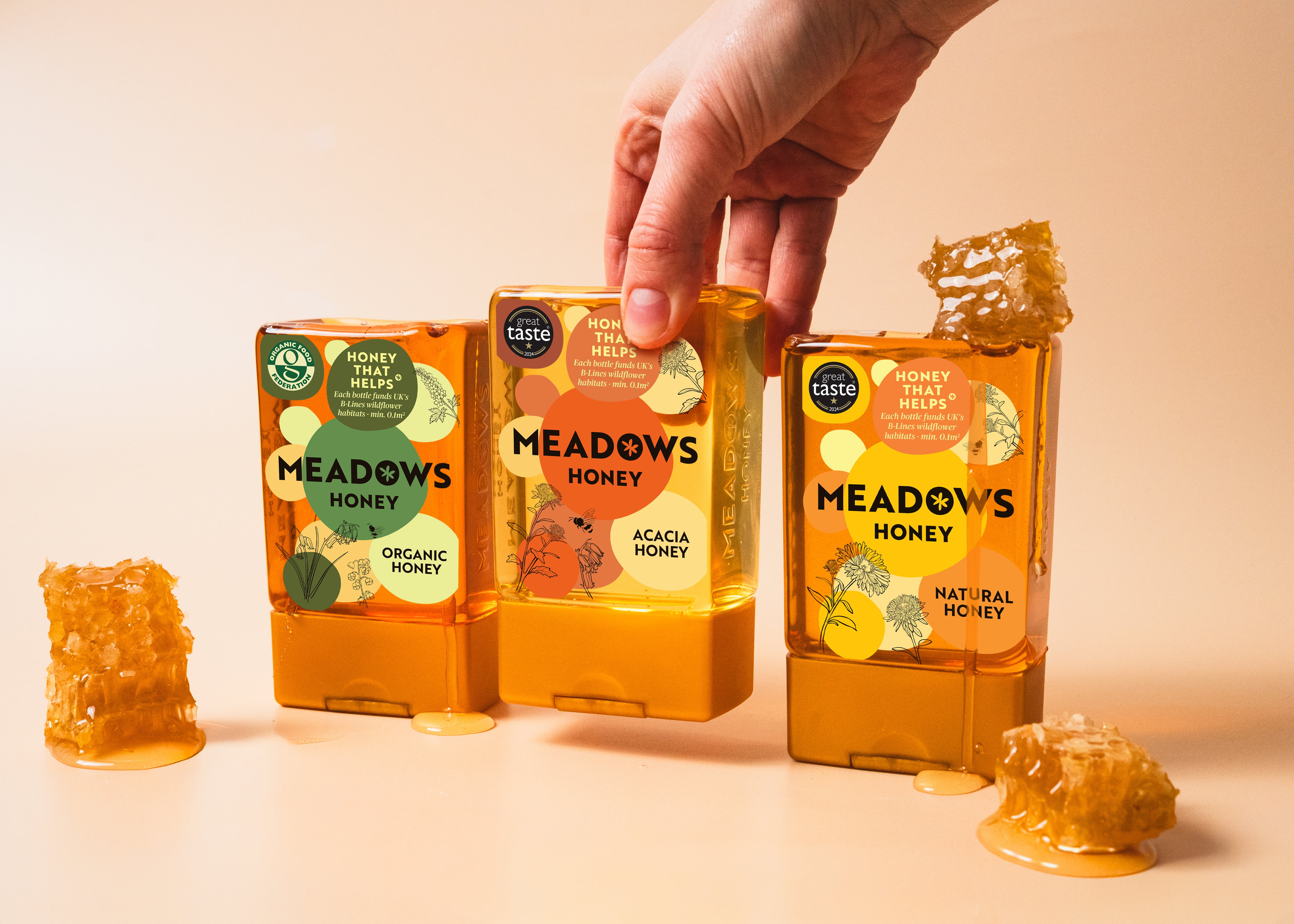
Meadows Honey recently introduced a new sleek squeezy bottle to sit alongside their existing range of glass jars and eco pouches. As part of a wider brand refresh, we were tasked with reimagining their iconic label for this new format, ensuring it felt modern, distinctive and ready to compete on busy retail shelves.
This wasn’t just a case of resizing an existing design. The new format called for a fresh approach. We explored updated illustrations, bolder colour combinations and a more impactful layout to ensure the product stood out against competitors while still feeling recognisably Meadows. The aim was to retain the brand’s heritage while pushing it forward into a more contemporary, shelf-ready space.
- Four distinct label designs, each representing a different flavour with its own colour palette and illustration style
- Updated illustrative approach to create a more modern, characterful look
- Bold, high-contrast colours designed to stand out in a crowded category
- Clear, confident hierarchy to improve visibility and readability on shelf
- Consistent branding across formats while adapting to the new bottle shape
Alongside the labels, we also designed a new tray packaging system for the bottles. Using high-resolution photography on the outer tray, we created the illusion of transparency, making it appear as though the bottles are visible from the outside. The bottles sit nestled in grass with bees in motion, reinforcing the natural, meadow-inspired brand world and creating a more engaging retail presence.
The result is a cohesive and confident evolution of the Meadows Honey brand. The new squeezy bottles feel fresh and modern while staying true to the brand’s roots, helping position Meadows more competitively alongside established names in the category.
A bold step forward that brings the Meadows brand to life in a fresh, impactful way.

.svg)
Instagram:

16 The Green, Newport Pagnell, Milton Keynes, MK16 0JW

© The Printshop MK Ltd trading as Anorak Agency 2026