
Fuego
TYPE
Spanish Tapas Restaurant
Sector
Food
Scope
Brand Guidelines, Brand Identity, Colour Palette Development, Logo Design, Menu Design, Signage Design, Staff Uniforms, Visual Strategy
date
March 2025
The Objective:
To create a brand identity and supporting materials that reflect Fuego’s authentic Spanish roots while appealing to a modern, local audience. The visual style needed to feel warm, vibrant, and unmistakably Spanish, helping to set the tone for both casual dining and special occasions.
The Plan:
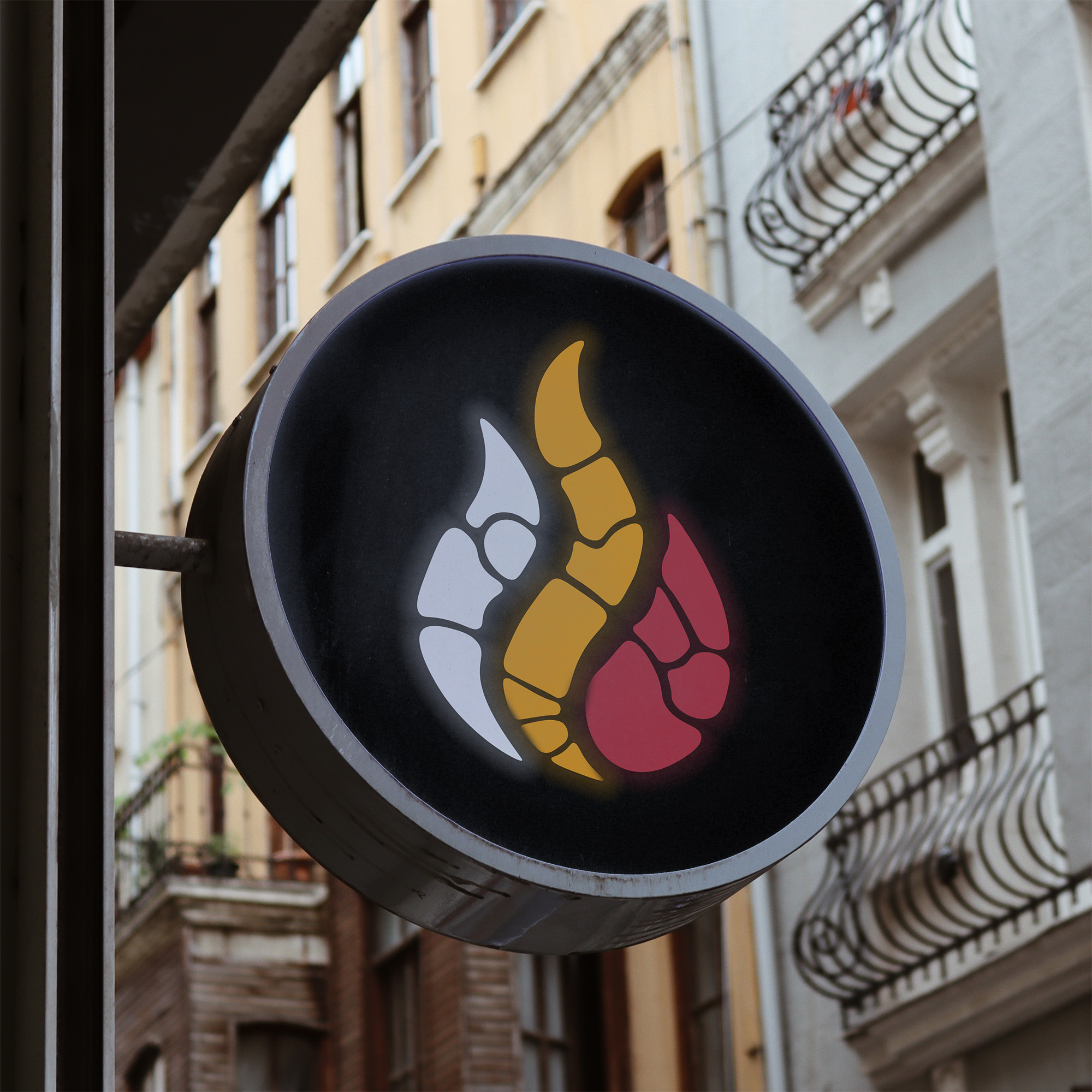
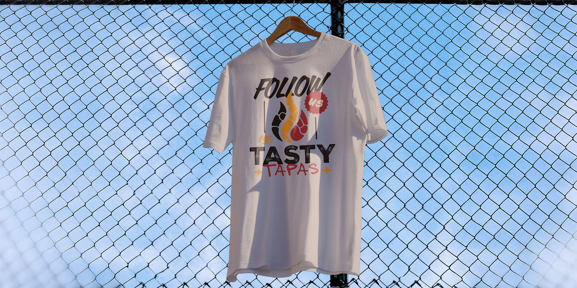
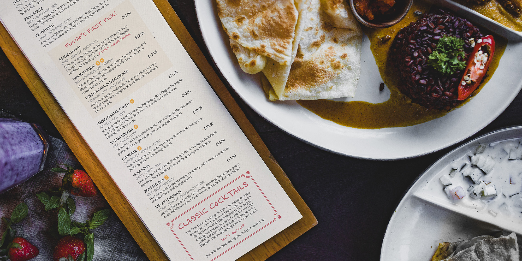
We focused on building a cohesive visual identity that could carry across signage, menus, and staff clothing. The colour palette was inspired by the Spanish flag—rich reds, warm yellows, and strong blacks—paired with mosaic-style patterns to evoke traditional Spanish tilework. Every design element was considered to ensure consistency, from exterior signage to the layout of the menus.
The Solution:
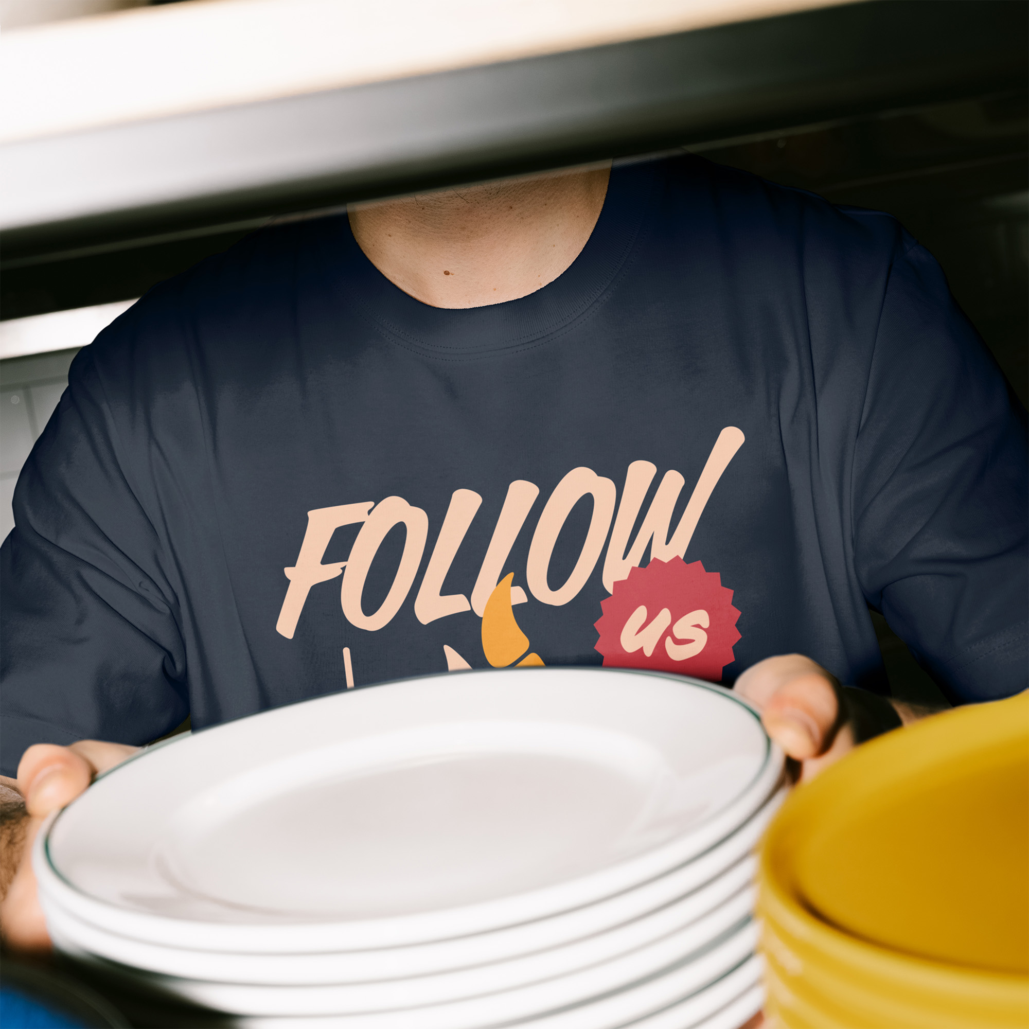
We delivered a complete branding package, including logo design, colour schemes, and graphic elements. This was applied to external and internal signage, clearly positioning Fuego on Bedford’s dining scene. Bespoke menu designs were created to match the restaurant’s premium yet welcoming feel. We also designed staff clothing that ties into the overall visual identity, reinforcing the brand experience from the moment guests walk in.
Fuego now presents a polished and authentic Spanish dining experience, visually tied together through consistent branding and carefully considered design elements. From the bold signage outside to the fine details of the menus and staff uniforms, every aspect supports Chef Juan Carlos and Beatriz’s vision of bringing true Spanish hospitality to Bedford.


.svg)
Instagram:

16 The Green, Newport Pagnell, Milton Keynes, MK16 0JW

© The Printshop MK Ltd trading as Anorak Agency 2026