
The Birch, Woburn
TYPE
Hospitality Group
Sector
Food
Scope
Brand Identity, Logo Design, Colour Palette, Typography, Menus Design, Signage Design
date
January 2026
The Objective:
Beyond Pubs recently took over a new location, The Birch in Woburn. They needed a brand refresh that aligned with the identity we had already established across their other sites, while giving The Birch its own unique personality that reflected the location and heritage of the pub.
The Plan:
- Branding Development:
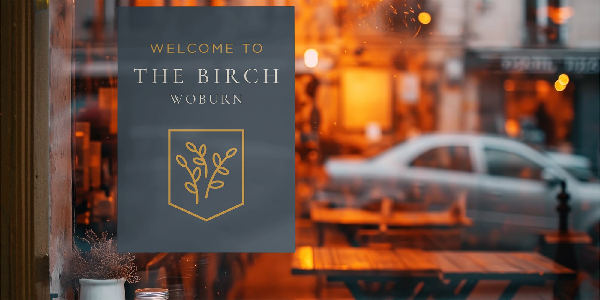
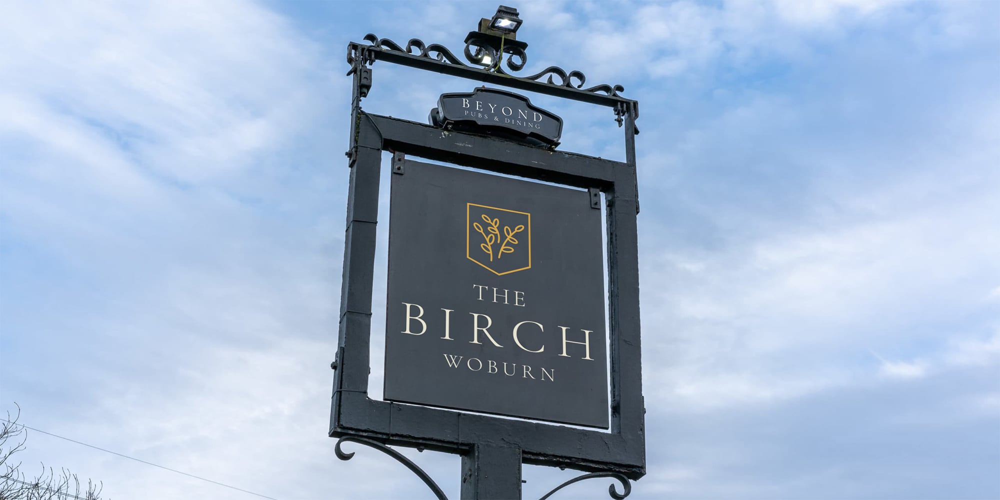
- Explored icon options for the shield, ultimately selecting a catkin to represent birch tree catkins.
- Chose a mustard yellow to reflect autumnal catkins and leaves, complementing the blues and greens of other Beyond Pubs locations.
- Maintained a consistent style across typography, colour palette, and visual elements to ensure seamless brand integration.
- Print and Signage Design:
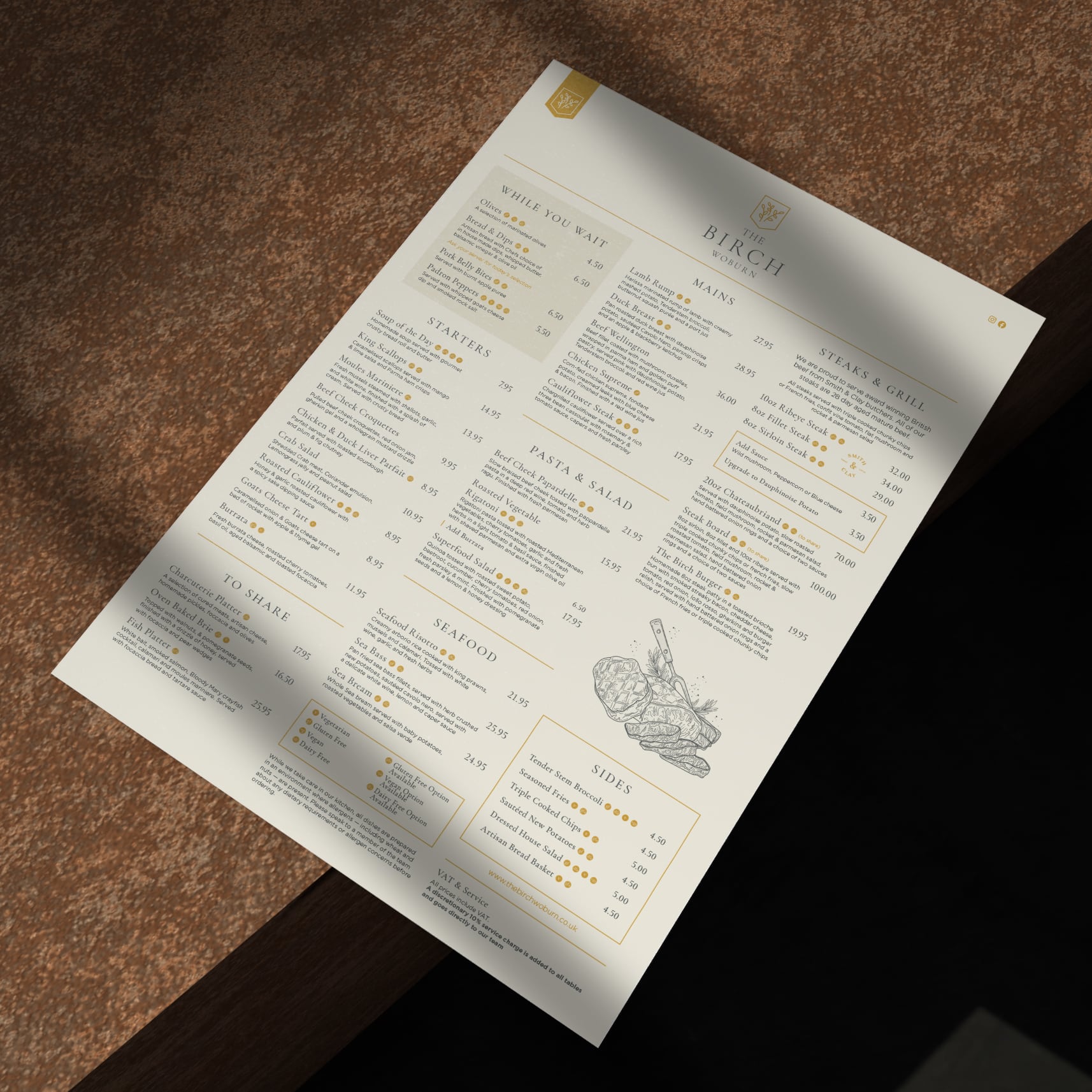
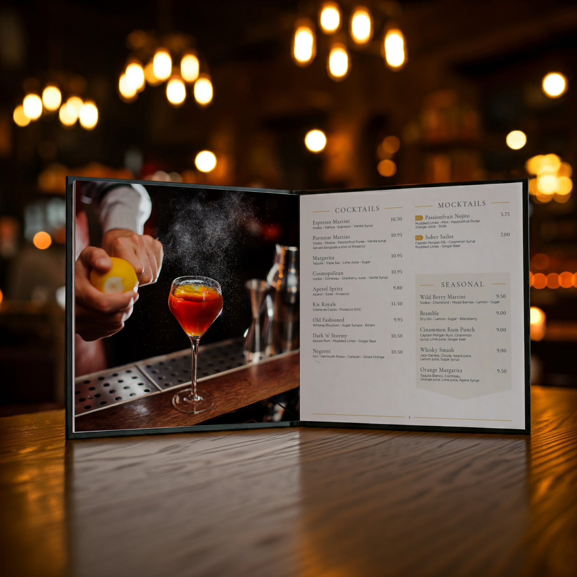
- Created a full suite of menus: Main, Drinks, Dessert, Lunch, Sunday, and Kids menus.
- Designed signage for the pub’s grand reopening, blending heritage elements with a modern look.
- Ensured all design elements aligned with the broader Beyond Pubs brand while giving The Birch its own character.
The Solution:
We delivered a refreshed brand identity for The Birch that visually connected it with Beyond Pubs’ other locations while giving it a distinctive personality. The menus and signage brought the new identity to life, creating a cohesive and welcoming experience for customers.
The Birch now presents a modern, approachable look that honours its heritage and fits seamlessly into the Beyond Pubs family, ready to impress visitors for years to come.


.svg)
Instagram:

16 The Green, Newport Pagnell, Milton Keynes, MK16 0JW

© The Printshop MK Ltd trading as Anorak Agency 2026