
Taylor Walsh - Proposal

TYPE
Estate Agents
Sector
Property
Scope
Logo Design, Brand Identity, Brand Guidelines, Typography, Colour Palette, Brand Copywriting
date
September 2025
The Objective:
Taylor Walsh, a renowned UK estate agency, relocated to Dubai and approached us to create a subtle rebrand that reflected this new chapter. They needed to simplify their brand while retaining heritage and prestige, and came to us for a modern, confident identity that would resonate in an international market.

The Plan:
- Logo & Symbol:
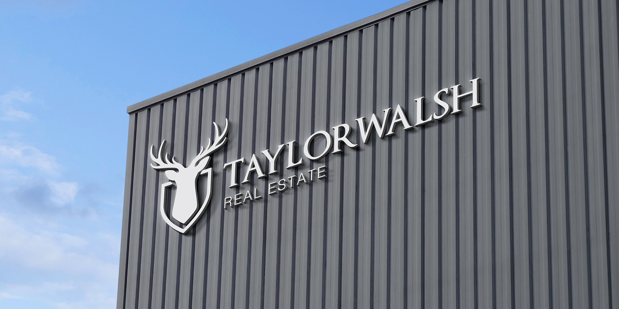
- Refined the iconic stag, making it symmetrical and placing it within a shield to reference British heritage and the style of a coat of arms.
- Typography and Colour Palette:
- Polished the signature typeface and paired it with a modern sans serif. Introduced a luxurious gold colour to signify prestige and the new international presence.
- Brand Copywriting
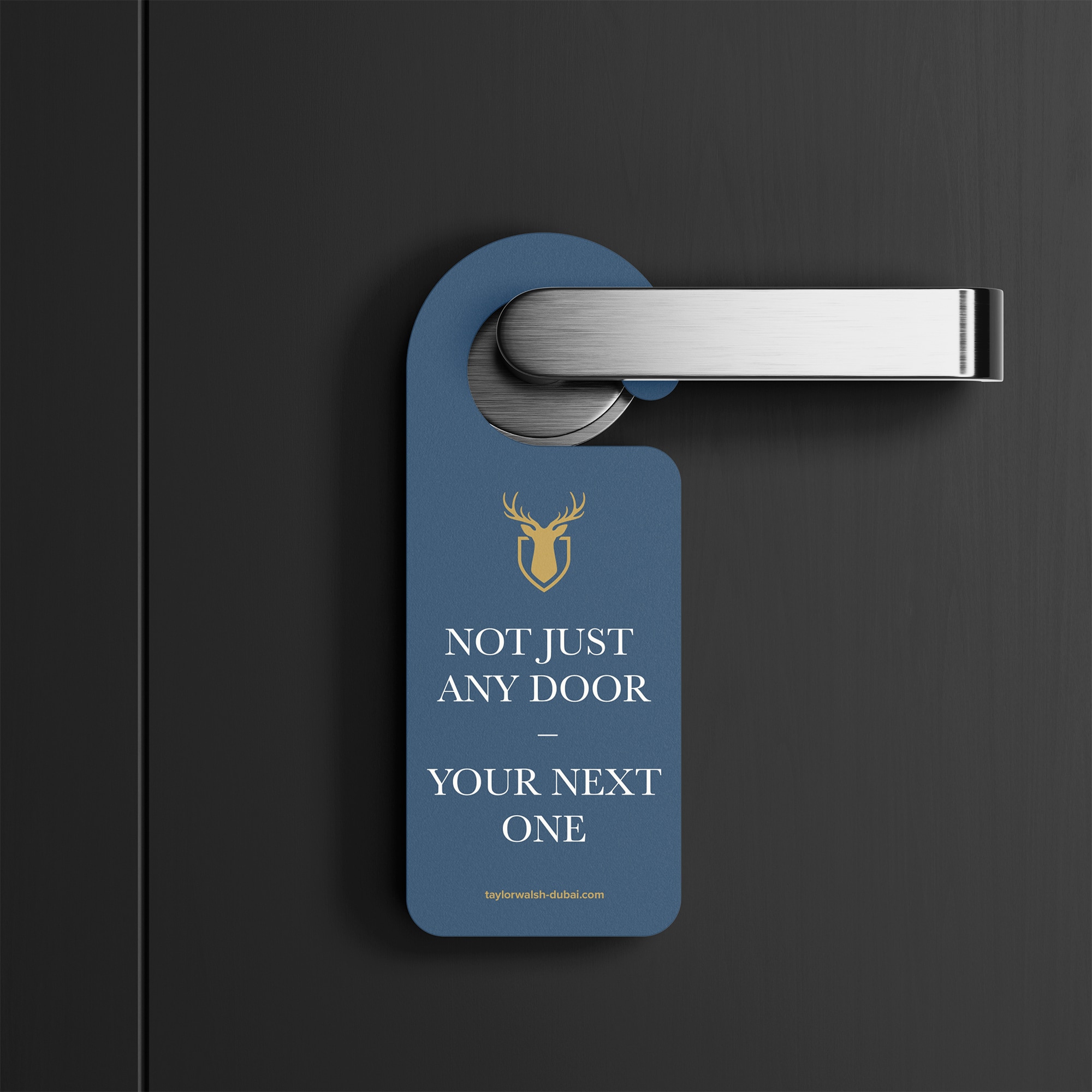
- Developed confident, concise copy to strengthen the brand’s voice and help Taylor Walsh stand out in the Dubai market.
The Solution:
The rebrand gave Taylor Walsh a subtle yet sophisticated identity that honours its heritage while signalling a modern, international outlook. The refined logo, contemporary typography, and gold accent communicate prestige, trust, and confidence.
The final result is a cohesive brand that positions Taylor Walsh as a premium estate agency in Dubai, reflecting both its storied British roots and ambitious new chapter abroad.


.svg)
Instagram:


16 The Green, Newport Pagnell, Milton Keynes, MK16 0JW

© The Printshop MK Ltd trading as Anorak Agency 2026